Before you send paid traffic to a landing page, or if you're wondering why existing traffic isn't converting, run through this audit. It takes under ten minutes and covers the issues that account for the majority of landing page conversion failures.
Work through each section in order. Mark each item as pass, fail, or needs review. Anything that fails is worth fixing before increasing spend.
Section 1: Message match (2 minutes)
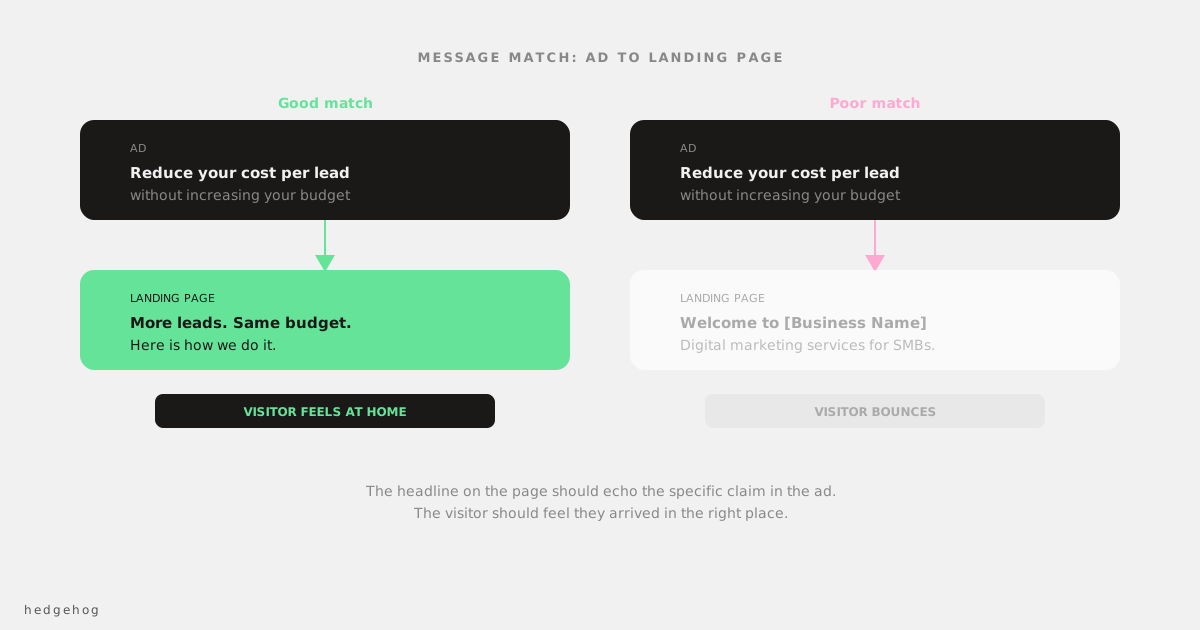
Message match is the alignment between what your ad says and what your landing page says. Poor message match is the most common reason paid traffic converts below expectations.
1.1: Headline mirrors the ad Does the headline on the landing page reflect the specific offer, claim, or hook in the ad that sent traffic here? A visitor who clicked an ad about "reducing Google Ads cost per lead" should arrive at a page whose headline speaks to that same outcome. ✅ Pass / ❌ Fail / 🔍 Review
1.2: Visual continuity Does the page feel like a natural continuation of the ad? Same colour treatment, same tone, similar imagery. A jarring visual shift increases bounce rate. ✅ Pass / ❌ Fail / 🔍 Review
1.3: Offer clarity Is it immediately obvious what the visitor is being offered and what they need to do to get it? They should not have to scroll to understand the proposition. ✅ Pass / ❌ Fail / 🔍 Review
Section 2: Headline and opening copy (2 minutes)
2.1: Outcome vs description Does the headline describe what the customer gets, or does it describe what you do? "Reduce your cost per lead without increasing your budget" passes. "Digital marketing services for Australian businesses" fails. ✅ Pass / ❌ Fail / 🔍 Review
2.2: Specificity Does the headline or opening paragraph include at least one specific claim (number, result, timeframe, or named benefit)? Vague language loses trust. Specific language builds it. ✅ Pass / ❌ Fail / 🔍 Review
2.3: Readability Can you read the headline and first two sentences in under 10 seconds and understand what this page is about? Read it as a stranger would on their phone. If it takes longer, the copy needs tightening. ✅ Pass / ❌ Fail / 🔍 Review
Section 3: Call to action (2 minutes)
3.1: One primary CTA Is there a single, clearly dominant call to action? Multiple competing CTAs (book a call, download the guide, watch the video, read the blog) dilute conversion. One primary action. Everything else is secondary. ✅ Pass / ❌ Fail / 🔍 Review
3.2: CTA copy is specific Does the button say something specific? "Book a free 20-minute call" passes. "Submit" and "Click here" fail. ✅ Pass / ❌ Fail / 🔍 Review
3.3: CTA is visible without scrolling Is the CTA visible above the fold on mobile? Most traffic is mobile. If a visitor has to scroll before they can take action, a meaningful percentage won't. ✅ Pass / ❌ Fail / 🔍 Review
3.4: CTA is repeated Is there a CTA at the bottom of the page as well as the top? Visitors who read the full page need a conversion path at the point where they've finished reading. ✅ Pass / ❌ Fail / 🔍 Review
Section 4: Trust signals (2 minutes)
4.1: Testimonials are specific Do the testimonials include a specific result, outcome, or observation? "Great service!" fails. "We cut our cost per lead by 40% in the first two months" passes. ✅ Pass / ❌ Fail / 🔍 Review
4.2: Testimonials are attributable Do testimonials include a name and, where possible, a company name and photo? Anonymous testimonials are less convincing than named ones. ✅ Pass / ❌ Fail / 🔍 Review
4.3: Social proof is present Is there at least one piece of quantified social proof on the page? Clients served, years in business, average results, recognisable client logos. ✅ Pass / ❌ Fail / 🔍 Review
4.4: A human face is present For service businesses especially: is there a photo of the person or team behind the business? This is often the single highest-impact trust addition for service pages. ✅ Pass / ❌ Fail / 🔍 Review
Section 5: Form (1 minute)
5.1: Field count How many fields does the form have? More than five fields for first contact is too many for most businesses. Count them. Fields: _____ ✅ 1-4 / ⚠️ 5 / ❌ 6+
5.2: Required fields are minimal Are only the truly necessary fields required? Phone number, company size, and "how did you hear about us" should all be optional or removed entirely at first contact. ✅ Pass / ❌ Fail / 🔍 Review
5.3: Confirmation is clear After submitting the form, does the visitor know what happens next? "We'll be in touch within 24 hours" sets expectations. A blank redirect to a homepage does not. ✅ Pass / ❌ Fail / 🔍 Review
Scoring and priority
Count your fails and reviews.
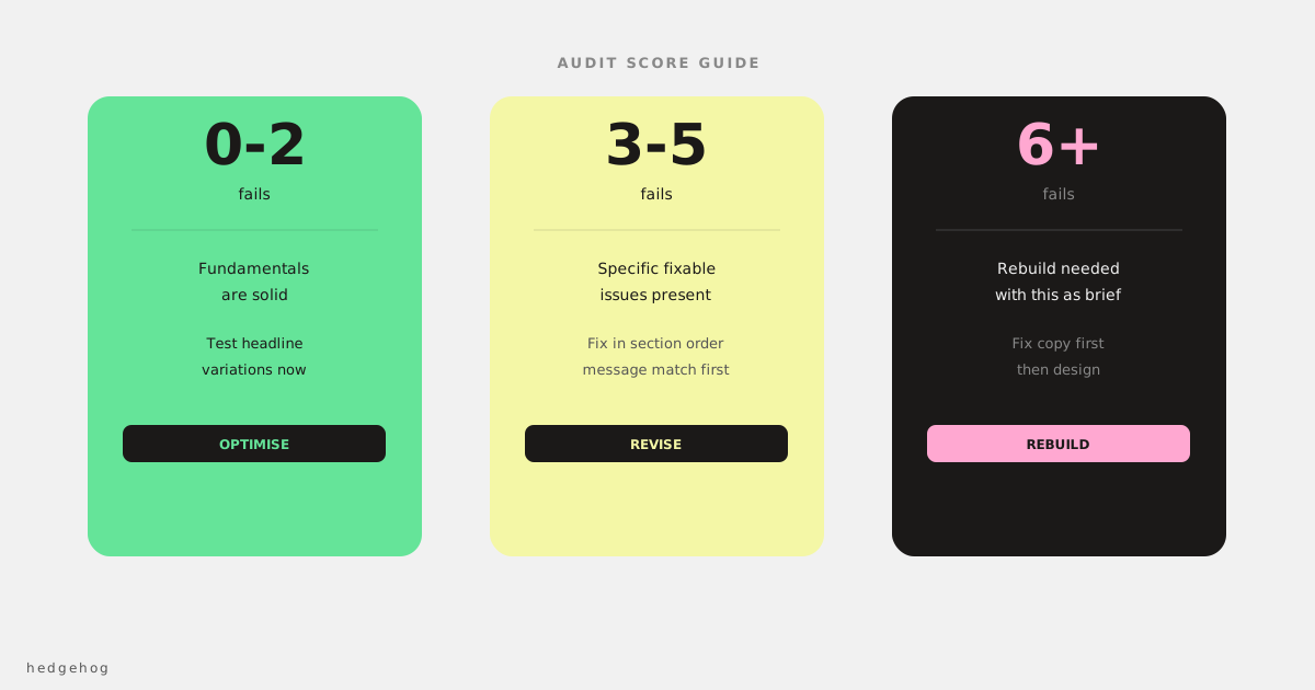
0-2 fails: The fundamentals are in place. Focus on testing headline variations and measuring what improves conversion rate.
3-5 fails: There are specific, fixable issues. Work through the failures in order of section: message match first, then headline and copy, then CTA, then trust signals, then form.
6+ fails: The page needs a rebuild with these criteria as the brief, not a design brief. Before spending on design, nail the copy structure.
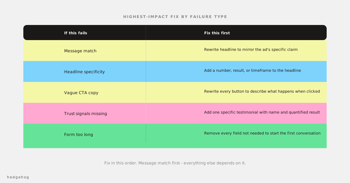
The highest-impact fix for each failure type
| If this fails | Fix this first |
|---|---|
| Message match | Rewrite the headline to mirror the ad's specific claim |
| Headline specificity | Add a number, result, or timeframe to the headline |
| CTA copy | Rewrite every CTA button to describe what happens when you click it |
| Missing trust signals | Add one specific testimonial with a name and a quantified result |
| Form length | Remove every field you don't strictly need to have a first conversation |
Use this checklist before every new campaign
The most expensive time to discover a landing page problem is after you've been spending on it for three weeks. Running this audit before a campaign launches takes ten minutes and can save a significant amount of wasted ad spend.
Save this checklist. Use it as part of your campaign launch process.