#Why Mobile Optimisation Matters for Email Marketing
Your audience is constantly on the move-checking emails while commuting, waiting in line, or scrolling before bed. When your emails are easy to read and interact with on a mobile screen, you benefit from:
- Higher open rates: well-designed emails encourage subscribers to stick around.
- Increased click-throughs: buttons and links that are easy to tap get more action.
- Stronger loyalty: a smooth experience keeps subscribers engaged with your brand.
- More sales and leads: mobile-friendly emails paired with optimised landing pages drive real results.
#Common Mobile Email Mistakes (And How to Fix Them!)
#1. Text That’s Too Small to Read
🛠 Fix: Use a minimum font size of 14px for body text and 22px for headlines to ensure readability.
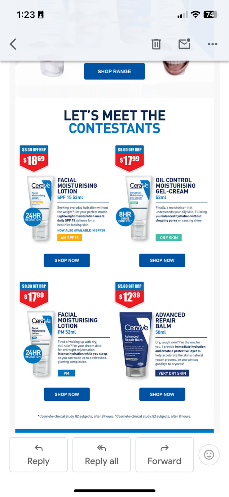
#2. Emails That Require Pinching and Zooming
🛠 Fix: Use a single-column layout and responsive email templates to fit all screen sizes.
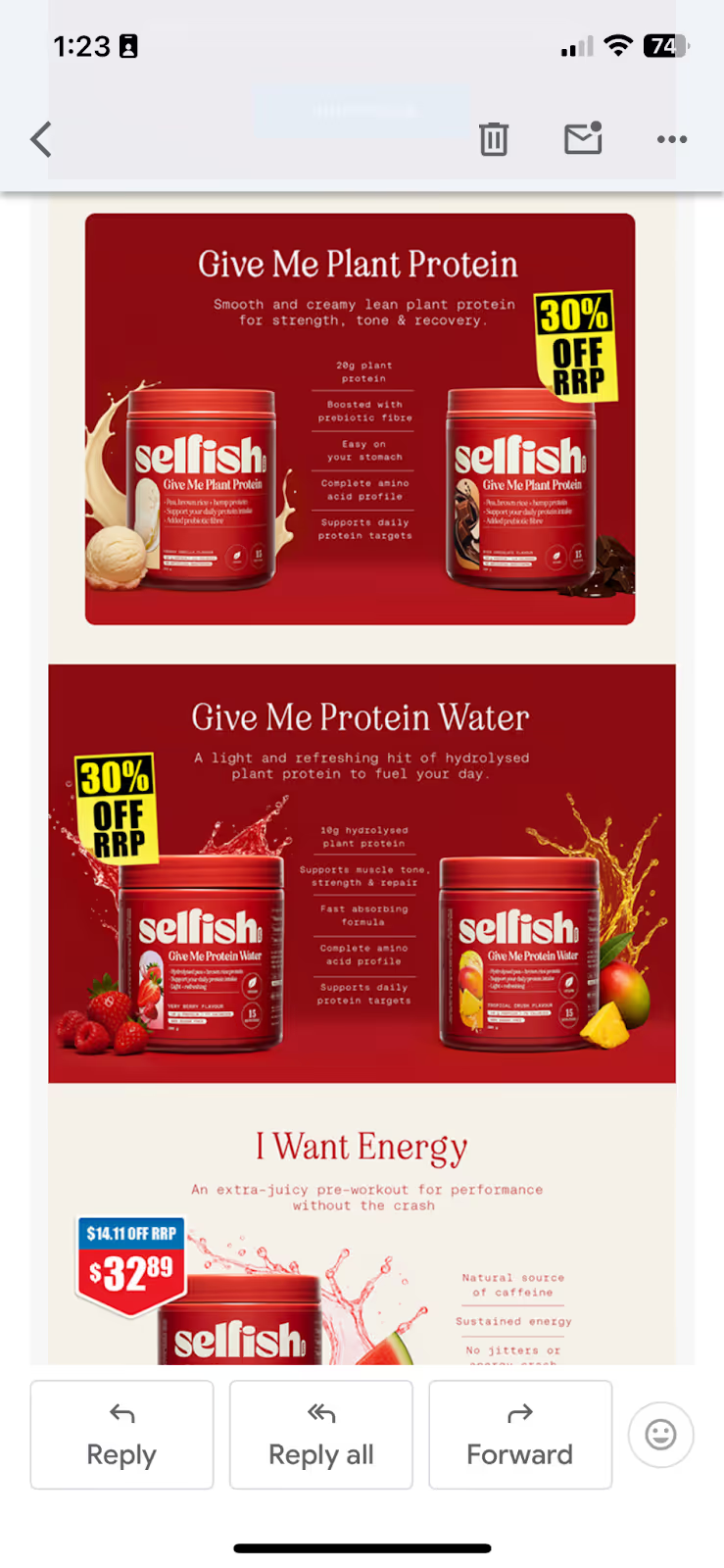
#3. Call-to-Action (CTA) Buttons That Are Hard to Click
🛠 Fix: Make CTA buttons at least 44x44 pixels and leave plenty of white space around them.
#4. Images That Don’t Load or Load Slowly
🛠 Fix: Compress images, use alt text, and avoid using too many large files that slow down loading times. Also avoid having a whole image as your only email content
#5. Walls of text
🛠 Fix: Use short paragraphs, bullet points, and subheadings to improve readability.
#Best Practices for Mobile-Friendly Email Design
- Use Responsive Templates: Most platforms (Mailchimp, Klaviyo, HubSpot, etc.) have built-in mobile-ready designs.
- Keep It Short & Scannable: Subscribers skim on mobile, so use concise copy and bold headlines.
- Prioritise Your CTA: Place your key call-to-action above the fold.
- Limit Heavy Image Use: Not all email clients display images, so make sure your message is clear without them.
- Always Test Before Sending: Tools like Litmus and Email on Acid let you preview across devices and email clients.
#Testing and Optimising Your Emails for Mobile
Before hitting send, always test your emails on:
✅ Multiple devices (iPhone, Android, tablets)
✅ Different email clients (Gmail, Outlook, Apple Mail)
✅ Dark mode settings (to ensure visibility in all viewing modes)
If something looks off, tweak your design and test again!
#FAQs
Q: What is a responsive email template?
A: A responsive template automatically adjusts to fit the screen it’s viewed on, ensuring a smooth mobile experience.
Q: What’s the ideal width for mobile emails?
A: 320–480 pixels is recommended for best readability.
Q: How many CTA buttons should I include?
A: One clear, prominent CTA works best. You can repeat it in different sections if needed.
#Conclusion
Optimising your email content for mobile is one of the simplest ways to improve engagement and increase conversions. By making small adjustments (like larger fonts, responsive layouts, and thorough testing), you can ensure your emails look great on every device and drive real results.
Start implementing these best practices today, and watch your email marketing performance take off.