In 2026, many Australian small businesses are still falling into the trap of thinking they need a total website overhaul to improve results. Most users don’t care about your new logo. They care about how fast they can find what they need. The “boring” updates that reduce friction often do more for your bottom line than any flashy redesign ever could.
#The Rebrand Trap vs. Real Results
It is tempting to think that improving website leads requires a fresh look. But website UX for SMEs is really about function over form. A rebrand might make you feel better, but if the underlying navigation is still confusing, your conversion rate will continue to suffer. We see businesses spend thousands on aesthetics while their “Add to Cart” or “Book Now” buttons are buried beneath layers of fluff.
The businesses winning in 2026 are not the ones with the prettiest websites. They are the ones with the fastest, clearest, most frictionless experiences. That is a profoundly unsexy insight, and it is also profoundly true.
#Speed: The “Boring” Update That Wins Every Time
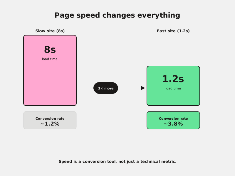
Landing page speed remains the single most important technical factor for conversion. In 2026, users have zero patience for slow-loading images or heavy scripts. Optimising your hosting, compressing your assets, and removing unused plugins are “boring” tasks - but they provide an immediate boost to your marketing ROI.
Google rewards speed, and so do your customers. A page that loads in under two seconds converts at a significantly higher rate than one that takes eight. It is often the difference between a viable business and one that bleeds leads every day without knowing why.
#Micro-copy and Button Clarity: Small Tweaks, Big Impact
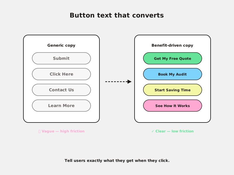
Stop using generic labels like “Submit” or “Click Here”. Successful Australian businesses use specific, benefit-driven micro-copy. Instead of “Contact Us,” try “Get Your Free Quote” or “Book Your Audit.” This small shift reduces cognitive load and tells the user exactly what they are getting for their click.
Every button on your site is a micro-decision point. If the button text is vague, the user’s brain hesitates. Hesitation kills conversions. Make it obvious. Tell them what happens next, not just that something happens.
#Form Friction: Why Less Is Always More in 2026
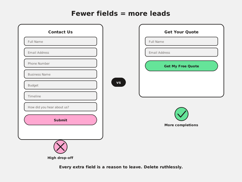
If you are asking for a phone number, an address, and a “how did you hear about us?” on a first-touch form, you are killing your conversion rate. Improving website leads often starts with deleting 50% of your form fields.
If you don’t need the data to start a conversation, don’t ask for it. Every additional field represents a point of friction where a potential lead can drop off. Start with just name and email. Get the rest on the call. A warm lead who gave you two fields is worth infinitely more than a cold form that no one submits.
#Trust Signals and Visual Hierarchy: Guiding the Eye
Your website structure should guide the user toward a single action. This means placing your primary call to action above the fold and supporting it with “boring” trust signals like local reviews, certifications, or simple security badges.
In 2026, transparency is the ultimate conversion tool. Customers are more sceptical than ever. A handful of genuine reviews near your CTA does more work than a wall of marketing copy. Visual hierarchy - using size, colour, and spacing to direct attention - is one of the highest-ROI investments you can make without touching a line of code.
Fixing friction points almost always outperforms a purely aesthetic redesign. The businesses that understand this are the ones pulling ahead.
#FAQs
Will these small changes really make a difference compared to a new design?
Yes. In our experience working with Australian businesses, fixing friction points almost always outperforms a purely aesthetic redesign. Function first, then form.
How do I know which “boring” update to do first?
Check your GA4 data to see where users are dropping off. If your bounce rate is high, look at speed first. If they drop off at the form, look at field count. Let the data tell you where the friction is.
Do I need a developer for these updates?
Many of these changes - like updating button text or simplifying forms - can be done yourself in most website builders. Speed optimisation may require some technical help, but compressing images is something anyone can do today.
#Conclusion
Focusing on the fundamentals isn’t flashy, but it is effective. A rebrand changes how your website looks. Speed, clear CTAs, short forms, and strong trust signals change how it performs. By prioritising these “boring” website updates, you build a foundation that actually converts traffic into customers - and that is the only metric that matters.